When I first saw Amanda’s Friendly Friday prompt, I was thinking: I have nothing to post! And yet here is a record-breaker of a post with 34 photos.
You see, I rebel against the ever-growing truth that photos are no longer taken but rather made.
I never use Photoshop or a similar tool. The only editing I do (with Windows Photo Gallery) is cropping and bringing shadows into the light. Oh, and I straighten, that’s useful. And sometimes I must go easy on warm colours because golden light here doesn’t care and just glows, which is how I love it.
With all this in mind I didn’t quite know what to do, but then I remembered that I used to play more with converting my photos into black and white.
.
B
l
a
c
k
&
w
h
i
t
e
.
I have a bit of a problem with (my) black and white photography. It’s not that I simply love colours too much. Obviously this is something for which lots of photography knowledge is required. It just won’t do to turn any photo into black and white and hope for the best.
This is how it was when I started.
Below are some examples from my first blog (which ran from 2014 to 2016). I won’t pretend that I know enough now to separate them into successes and failures. You can do that by yourselves (if you are able). You can also tell me about it, it would be interesting.
In every line there is a pair with the photo as taken and the exact same photo converted into black and white (or the other way around). Some conversions are cool, some exaggerated, some unnecessary. Let’s just say there are reasons why I rarely do it any more.

Ominous bird. 
Cheerful bird. 
Droplets. 
Other worlds. 
La Luna, Giardino dei tarocchi. 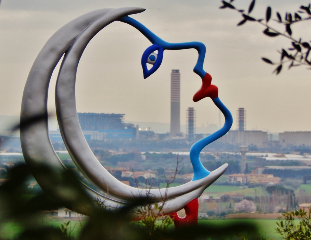
Niki de Saint Phalle designed it in colour for a reason. 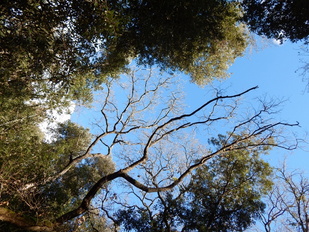
Just a tree. 
What a tree! (I couldn’t believe this was the same photo as before.) 
A surreal tree. 
I once knew the name of this tree but forgot. 
Three pines in our mini park. 
Guardian shadow heroes. 
Siena scene, after. 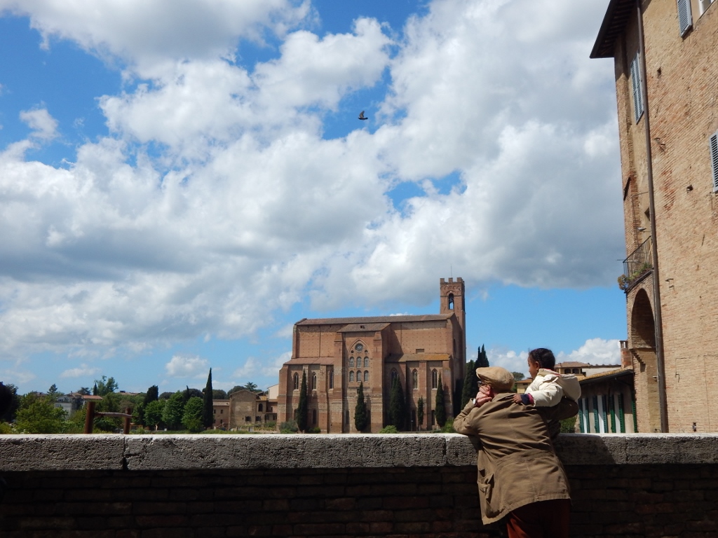
Before. Better. 
Tuscania fountain. 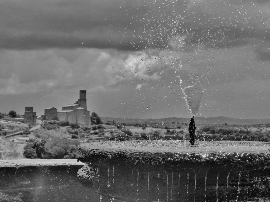
In a way you see more this way, but also less. 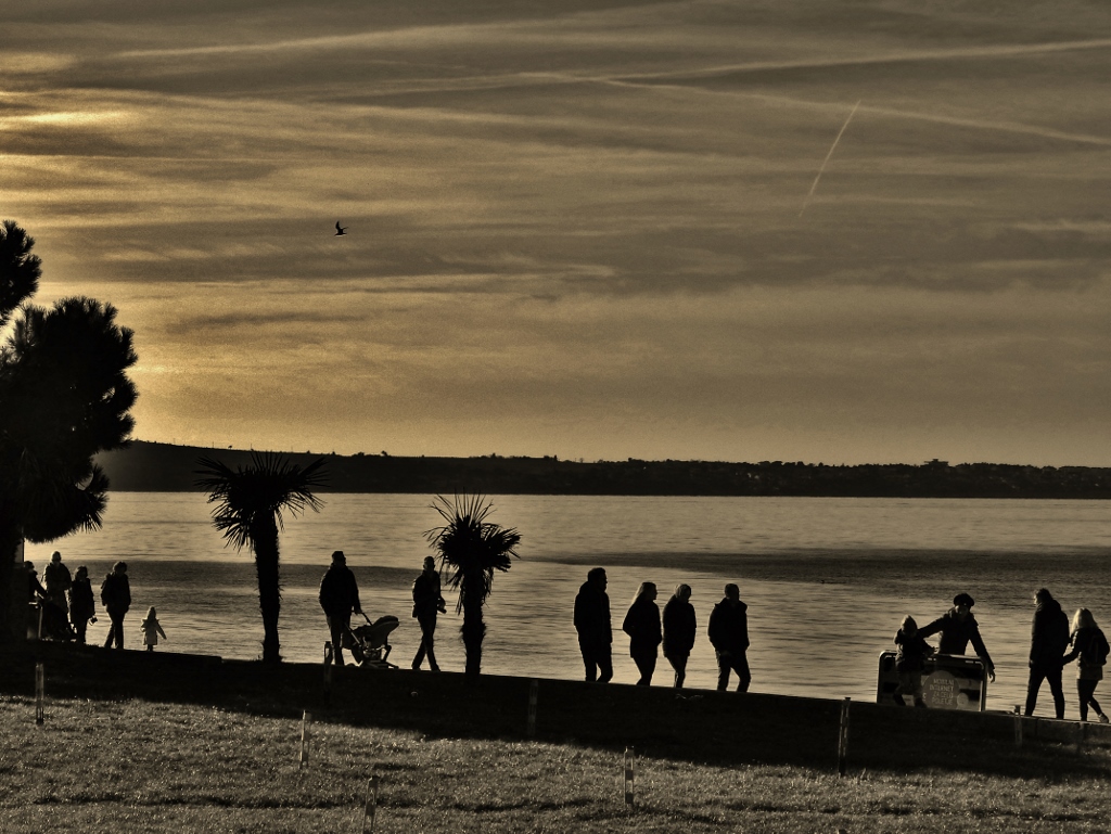
Between Portorož and Piran, overedited. 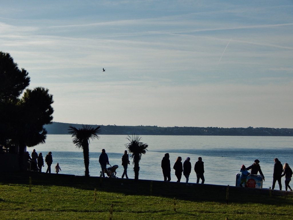
December 31 2015. The last stroll of the year. 
Piran, temporary statues. 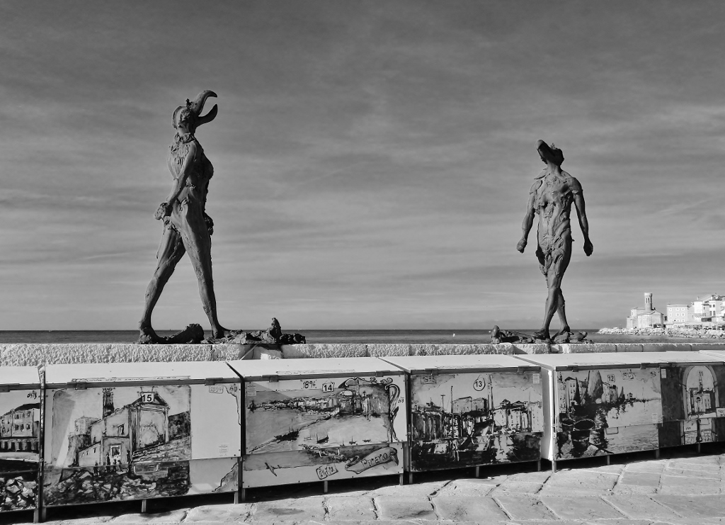
She-he. By Jakov Brdar. 
Piran sunset. 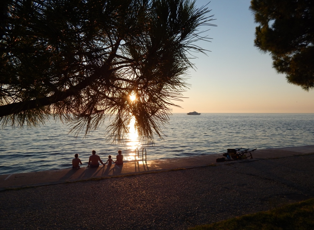
I’m not sure which one I prefer. 
Also in Piran. 
Bestia has a good b&w potential. 
Isola del Giglio. Where Costa Concordia toppled. 
Much more cheerful. 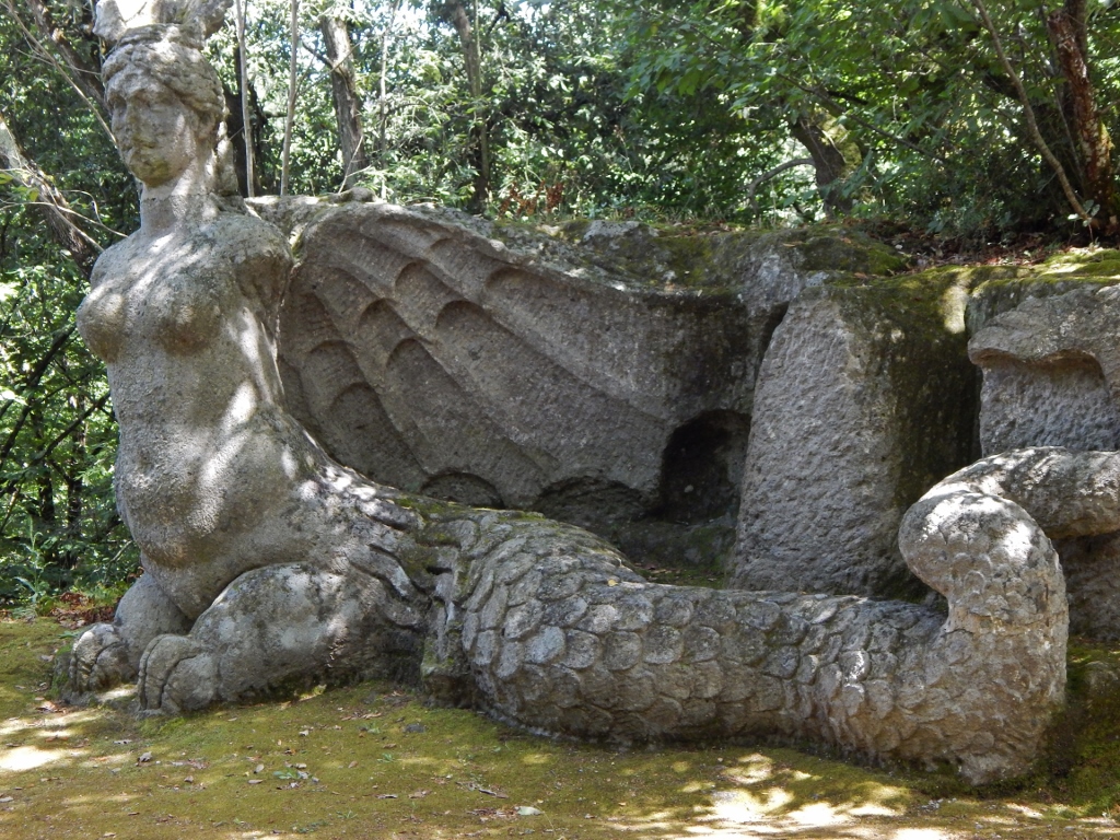
Sacro Bosco, Bomarzo. 
Not called the Park of Monsters for nothing.
And finally, here are six black and white photos posted on my first blog that I still quite like, but I can’t find their colour counterparts. They were either shot in black and white originally – plus red one time (I never do this, was just playing around) – or I managed to lose the originals since back then I wasn’t so careful to save them before any conversion as I am now.
Now I know that I never know when I’ll hate the edit, wishing to give a photo another life.
The Italian job. 
An Etruscan bridge at Vulci. 
Piran arch and door. 
Timelessness. (One of the first photos taken with my then new camera. January 2015.) 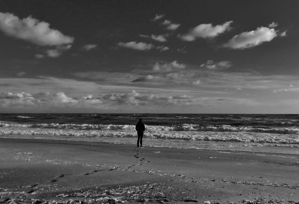
Waiting for the seventh wave. 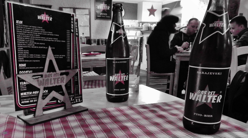
Das Ist Walter, Ljubljana.
For Friendly Friday Photo Challenge hosted by Amanda from Something to Ponder About: Photo edits


Very nice shots Manja but I keep on preferring you colored versions ☺️
LikeLiked by 2 people
Ooo, yes yes, no doubt, colour shall continue. 🙂 This was just because the prompt called for edits. Thanks, Flavia. Greetings to Uruguay! (or is it Paraguay by now! 😉
LikeLike
I am back to Buenos Aires but tomorrow we are flying to Ushuaia, in the very South of Argentina 😍 we are making every day something different, it is different also for me to keep track of everything 😂💪
LikeLiked by 1 person
Sounds most excellent. Have much fun!
LikeLike
You always have sth to say. Very ‘colorful’ indeed.
La luna, wow.
LikeLiked by 1 person
Thank you, Bojana. Do you see that building through the Luna? It was meant to be a nuclear power plant but the locals protested (back in the the day). Now it’s a thermal plant but it’s rarely turned on.
LikeLiked by 2 people
Thank god. A rare case when sanity prevailed.
LikeLiked by 1 person
These are all great, but I love that face looking up 🙂
LikeLiked by 1 person
Of the moon statue or of bestia, Dan? 😉 Thanks!
LikeLiked by 1 person
Haha both are pretty cute, but the moon. Bestia is always a delight to see.
LikeLiked by 1 person
Those trees!!! What you did with them in black and white, is amazing. I felt like I was lying on the ground, in Slovenia, looking up. The surreal tree was something that would suit a large wall canvas.
LikeLiked by 1 person
Thank you, Amanda! Ah, but the tree photos were all taken here in Tuscany. 🙂 Slovenian trees are also amazing in black and white, I’m sure. Just like in colour.
LikeLike
I am sure they are. One day I will verify that for myself!!
LikeLiked by 1 person
A wonderful set of selections, Manja! I love the last two photos especially.
LikeLiked by 1 person
Thank you, Amy! 🙂 I’m glad I put them at the end then.
LikeLiked by 1 person
My favorites are all the trees and the fountain… I liked what you said about seeing more but also less. In B&W I guess the photographer makes a choice on behalf of the viewer, tells you what you should see or how you should see it… hmm 🤔
LikeLiked by 1 person
Oh, interesting… I always hate it if others make choices for me. Might be that’s why I prefer colour photography so much. Thanks, SMSW!
LikeLiked by 1 person
Black and white is great for architecture. I especially like the bridge. (K)
LikeLiked by 1 person
Thank you, K. Yes, I believe that, but as I say, I suppose in black and white you must know a bit more what you are doing and not just click, how I tend to live.
LikeLiked by 1 person
I think you know what you are doing just fine.
LikeLiked by 1 person
I’m not normally a fan of B&W, but there are a few in here that could make me change my mind … the droplets/other worlds, the fountain spray, and YES! The tree!! Nicely done 🙂
LikeLiked by 1 person
Thank you so much, Joanne. 🙂 I suppose it’s easy when you make a compilation and you can choose only the best ones. 😀 I once heard that a photographer is as good as the selection of the photos s/he shows (heavily paraphrased).
LikeLike
Exactly. I once went to a talk given by a photographer often featured in National Geographic. He said that it was common to take a 1000 photos for just that one special shot.
LikeLiked by 1 person
I still remember seeing my dad developing film on his makeshift lab on our bathroom. He already did a lot of “post-processing” those days, from playing around with chemicals to stuff like “dodge and burn” (exposing some areas of the film more than others, to highlight or hide a part of the image). For him, those hours locked in a dark bathroom were as much fun as taking the pictures.
When I took up photography, it seemed only natural to follow the same footsteps (fortunately, digital had already replaced film, so I got to ditch the dark bathroom for a comfy chair in front of a computer). I have a lot of fun looking at a picture, imagining how I want it to look, and then trying to get there.
Like you, I also like colour more than B&W, but I think some photos are just meant to be colorless. For instance, the B&W versions of the first two immediately draw the eye to the most striking elements on the photo (the power lines and the water droplets).
Perhaps there’s room for all kinds of edits. Except selective colours like the last one, those should die a slow and painful death 🙂
– Verne
LikeLiked by 1 person
Thanks, Verne, I appreciate your input. It sounds lovely, the process as you go through it. Whereas when I see a photo, it’s all about how it makes me feel as it is.
Serves me right for including the only selective colour photo I’ve ever taken. 😀 What was I thinking?
LikeLiked by 1 person