Black and white photography is for those who know what they are doing. If you merely click and hope for the best like me, it can get tricky. Here are some comparisons.
B
l
a
c
k
.
&
.
w
h
i
t
e
Looking at Anne’s example photos in her Lens-Artists guest host post, it becomes clear that if a photo is to work in black and white, it must be great to begin with. Sometimes a photo can be salvaged by turning it b&w. But mostly – personal opinion, of course – black and white photography should be left to photo artists.
At the start of my blogging path eight years ago, in my fearless manner I thought I could do it all and took part in Leanne Cole’s Monochrome Madness challenge. Every week I turned one of my photo in b&w, and in your gentle manner nobody told me that I should stop doing it.
Now I had a look at those weekly posts and selected a few that stand the test of time, but most were really rubbish. I shall do it like Sarah at Travel with me did it two weeks ago: I’ll compare the photo in colour as taken with the photo turned b&w (in my really low-key old-school Windows Photo Gallery way. I have yet to use, or pronounce, any of the tools that pros use).
I add some newly converted and I promise I will not do it soon again.
Why did I do it? Only because the challenge asks for it. I’m done with b&w, unless I learn more about photography. I love my colours too much. Happy to say, there are some nice colourful examples in my blogging history at the end of this post.
You are welcome to give your critique if you wish, or say which conversion works best, but really, this is the best I can do.
Oh, as for England vs. Italy, the calcio final that is going on right now, greetings from Italy. 😀 (For now it’s 1:0. No sunglasses. It’s raining.)

And now, in my Mexcessive manner, here are 16 couples and one threesome. I wish you much fun.


Stadio dei Marmi, Rome.


Palazzo della Civiltà Italiana, “The Square Colosseum”, Eur, Rome.

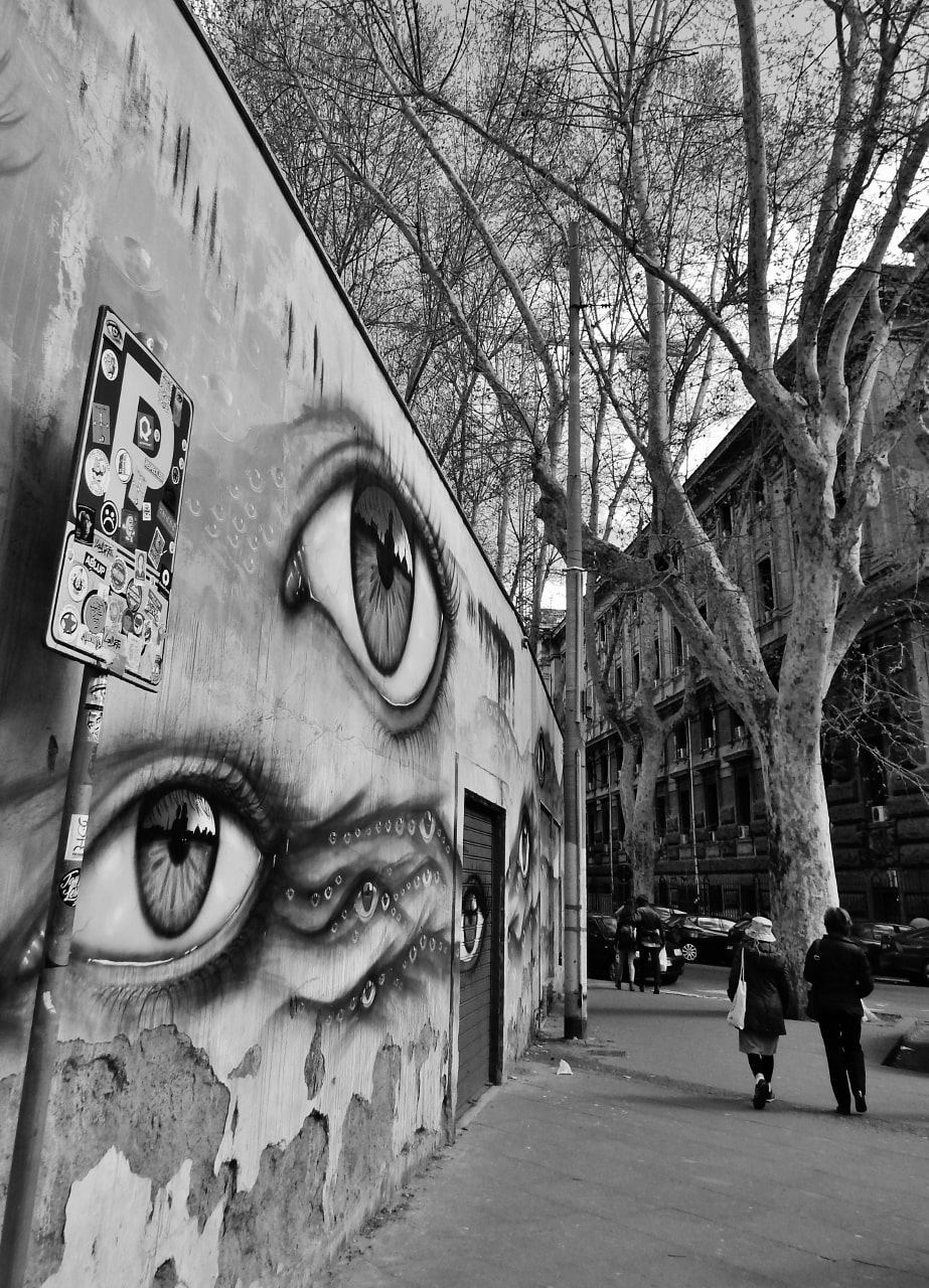
Street art by My Dog Sighs. Trastevere, Rome. I love his brown tones so much, but it works.


Ljubljana Town Hall. I quite like this conversion.


Piran, Slovenia. In b&w the ugly sky is salvaged. But the colours are lost.


My parents’ house, Piran. Light fixture made after my father’s design. B&w turns it into a lifestyle magazine shot.


The top of Matajur, on the border between Italy and Slovenia, a WWI Isonzo Front battlefield.


Just a bird. Something happens to this photo in b&w. It turns cinematic.


Lake Zbilje, Slovenia. Much improved, I believe.


Just some pretty cool droplets.


It was not a good photo to begin with, but it’s better now. Orbetello.


Krvavec ski centre in the summer, taken 25 km away off my parents’ doorstep in Ljubljana.


Giardino dei tarocchi, by Niki de Saint Phalle. A completely new design emerges.


A Roman apartment house. This staircase deserves a better photographer.


Ljubljana Christmas decorations.
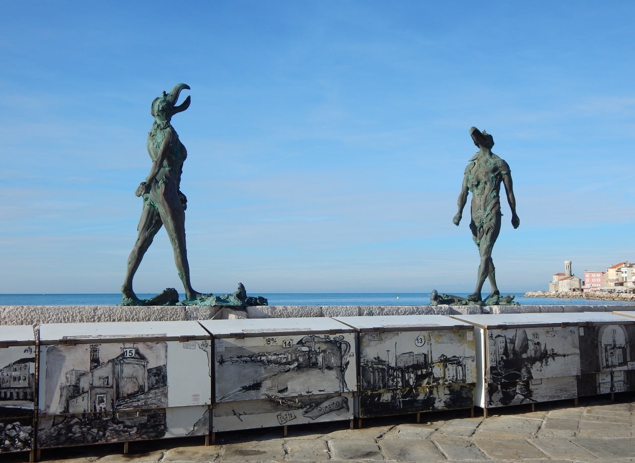
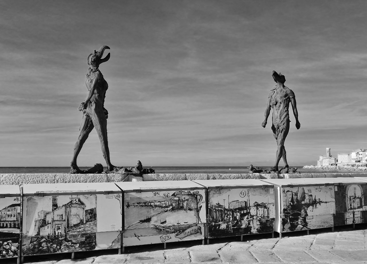
Temporary display in Piran: “She-He” by Jakov Brdar.


A final threesome with two different black and white edits.
For Lens-Artists Photo Challenge, guest-hosted by Anne at Slow Shutter Speed
This day in my blogging history


I prefer colour photographs as they have so much more life I feel. B & W should be taken with black and white film, I think, as the experts do. Digital black and white can be a bit dead, it certainly lacks that oomph factor for me and as for conversions, they never work in my opinion.
LikeLiked by 1 person
Thank you, Mari, for your opinion. I’m pretty sure that you’re right. This oomph factor is hard to come by. Let the experts be experts. We can only play a bit.
LikeLike
MMM, although I sort of forced you into it, your black and whites are beautiful! I’m glad you took this on. Not every photo translates well into black and white, but when it does, it’s beautiful. I hope you’ll give it another try when you wonder what a certain image would look like in black and white. You have the artistic bent for it. Well done!
LikeLiked by 2 people
Ahh, thank you for the encouragement, Anne. Artistic bend! This sounds lovely. The truth is that I never wonder that, how something would look in black and white. 😀 Maybe I need to start.
LikeLiked by 1 person
I like a lot of the B&W versions better. I need to think of this more often.
LikeLiked by 1 person
Makes one think, right? Thank you for watching, Dan. It was a thick post.
LikeLiked by 1 person
These are all beautiful, with or without color.
Btw, I’m watching calcio with hub now ( go figure!) and saw that funny pic already. Did you see this one:
https://m.facebook.com/initalyNZ/videos/217385726782583/
LikeLiked by 1 person
Yes, I saw that. But — who are you cheering for? 😉 Thank you for liking my views, Bojana.
LikeLiked by 1 person
What do u think?
LikeLiked by 1 person
Italia, Italia! 😀
LikeLiked by 1 person
Certo.
LikeLiked by 1 person
Same here…loving bright colours too much. Great images you have for this week Manja!
LikeLiked by 1 person
Thank you, Teresa. I’m glad you like them even though they are so… dull when converted. 😀
LikeLiked by 1 person
Nope not dull for me. But we both just prefer bright and colourful … we are biased. Haha
LikeLiked by 1 person
I tend to prefer color, but b&w can be fantastic as well. Although I really like your photos, you just have too many for me. I like to be able to comment on specific photos but there are so many that I have to go back and forth and back and forth to do so. I really like the shot of the drops, in either color or b&w. The POV from which you took the shot of the first statute took me aback, then made me laugh. One shot I know I preferred in B&W is that of your parents’ house. 🙂
janet
LikeLiked by 1 person
Ohh, Janet, I understand completely. Sorry but I wished to do away with all these now because I won’t be having another b&w post any time soon. I often think of having a go and trying to select THREE photos for a post, as a challenge as you said. 🙂 I find even the idea of it almost impossible. We shall see. Thank you for having a look through and commenting despite.
LikeLiked by 1 person
❤
LikeLiked by 1 person
I enjoyed your thoughts about black and white photos and I recall leanne’s monk theme (feels like she’s since I have seen her logo)
And I LOVED the little slideshows for each photo – as well as the content on each photo – well done
LikeLiked by 1 person
Thank you, Prior. It was quite a heavy post, I’m glad you found some sense in it. I haven’t seen Leanne around for a while now either.
LikeLiked by 1 person
O h I am not sure the post felt heavy to me – not at all – it was actually light in some ways with the little slides for each image and then your writing was succinct and flowed well with interesting tidbits –
I guess. just think of heavy as grief or someone with too much feeling expressed – lol
LikeLiked by 1 person
Good! I was afraid I might have been too Mexcessive even for my standards. 😀
LikeLiked by 1 person
Hahaha – Mexcessive is a fun word
LikeLiked by 1 person
Apparently you think you can’t do black&white and that is only for experts and photo artists… Well, you’re a photo artist then, your black and white photos are great.
Also, watched the game and Thank you, Italia! There were fireworks going off in Glasgow last night 😀
LikeLiked by 1 person
Ahhh, if you like them, Sofia, then all is well. 🙂 I trust your vision. As for this last – you naughty people! 😀 Thank you, it was tense.
LikeLiked by 1 person
You’re welcome 🙂
LikeLiked by 1 person
You do yourself a disservice – many of your edits are very effective. You are right to say that you can’t make a bad photo into a good one by simply turning it into B&W, but you have started with some very good images and several of them look even better in B&W I would say – the opening Stadio dei Marmi shot, the ‘Square Colosseum’, the gate at Orbetello, the WW1 battlefield shot (in that one the texture of the framing rock is brought out and the scene looks more moody). But the street art needs colour, I feel – it deserves to be seen as the artist painted it. And the staircase could work well but needs the contrast boosting perhaps?
By the way, I love the light fitting in your parents’ house! And thanks for the link to my post 🙂
LikeLiked by 1 person
Thank you so much, Sarah! I’m glad that you see some potential. The light was very bad on that staircase. That moody cave scene edit is new, I did it yesterday. Most of the others are from my blogging beginnings. Yes, I agree very much about street art to remain as is, that’s why I was quite surprised that I liked the eye shot also in black and white (I posted several shots of this scene in all its glorious colours many times before). Well, we shall see how it continues, but for now I’m really glad that I have drained this subject for a while.
LikeLiked by 1 person
I disagree about your black and white photos. I like especially the architecture, in particular the Square Colliseum. (K)
LikeLiked by 1 person
Thank you most kindly, K. Well, here I gathered all the photos with at least some potential. Architecture is a good b&w subject. The thing is that I don’t get much joy out of it.
LikeLiked by 1 person
That’s an important consideration.
LikeLiked by 1 person
That eyeball mural is more powerful in b&w otherwise I think it’s the composition that matters more than whether or not they’re in color. The more complicated the composition, the clearer it is in b&w. At least that’s what I think but I’m no expert!
LikeLiked by 1 person
Thank you, Jan. Interesting and great to see different opinions on the matter. I really don’t know if a photo would work in b&w until I try it out.
LikeLike
You offer some lovely contrasts, Manja, but I’m viewing on my phone so not doing them justice. 🤗💕
LikeLiked by 1 person
Thank you, Jo. Yes, I can imagine that the phone is not the best for such comparisons. If you remember, check them out on the big screen one time.
LikeLiked by 1 person
These are excellent! So many of them look entirely different in B&W. The mountain photo completely pops in black and white, while in colour it seems faded.
LikeLiked by 1 person
Thank you, Crystal. Yes, all sorts of things happen. Clouds are tricky, hiding things that only come out in black and white. It can be a nice game and exercise but it’s really time-consuming to check which photo could potentially work if converted. I cannot tell at a glance, I must try it. 😀
LikeLiked by 1 person
Yeah, me too. I always have to try it, to see what the effects will be.
LikeLiked by 1 person
First let me say, I thought the little arrow thing to change the photos was great (after I figured it out)!! I would need to take notes on this post, but from my memory, I’d say about half I preferred in the color and half in the black and white!! The last one with the trees, I arrowed several times and I did prefer the black and white. (I have not done anything with black and white, I would be afraid to!! Ansel Adams set a very high standard!)
LikeLiked by 1 person
Hahha, that’s quite right, Carol, about Ansel Adams. 😀 He did it all and said it all! I especially like this: “There are always two people in every picture: the photographer and the viewer.” I love it how diverse our opinions are. It would be so boring if we all did and thought the same. Thanks for your input!
LikeLike
They’re all great in color, but really well in black and white too. I love the eyes on that mural. They’re amazingly good!!
LikeLiked by 1 person
Thank you, Deborah! I’m really glad that you say so. And I was glad to be able to see these eyes for myself. My Dog Sighs, the artist, caught just the right features of the Italian eye.
LikeLiked by 1 person
They surely did!! 😀
LikeLiked by 1 person
I absolutely love the feel of mystery in the b&w version of the top of Matajur. Oh, and the raindrops too. 😊👍
LikeLiked by 1 person
Thank you, Irene! 🙂 This was quite a task. My eyes are fully untrained to determine which photo would be any good in b&w before I try it out.
LikeLiked by 1 person
Same here but it is fun learning. 😊
LikeLiked by 1 person
GREAT selections. LOVE the water droplets. Superb. Also love the England vs. Italy tally. Har!
LikeLiked by 1 person
Ahh, thank you, John. I’m glad you say so. I tried to choose the best examples possible. And yes, Italy is still celebrating. 🙂
LikeLiked by 1 person